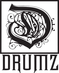
ROYAL D LOGO
 SPECTR
THE ROYAL D LOGO CONCEPTION HISTORY
While there are many parts to the why’s & how’s of DRUMZ history & I’ll get to those tales later on, but when it comes to the OG “D” logo well it was love at first sight. I was just cruising through some old junky font sites. “Back in the days we didn’t have DaFont or a lot of these other popular font sites HaHaHa lol.” Larrabees Fonts was the only proper site back then. Besides Larrabees it was just picking through a bunch of random pages with smaller themed font packages. Digging through them somehow I came upon that “D” and I knew it was “the one”. I mean there’s no other “D” like that. Once I added a few elements for symmetry & vectored the letter I knew I had our as we now call it ‘Registered Royalty Mark’. It’s so ornate & beautiful but it’s regal & strong, looks like liquid fire ready to cut you up. It has pride & class but looks wild too. That’s the feeling of a good heavy bass beat after all – something raw, dark & beautiful sculpted & crafted with both passion & intelligence – SPECTR


